FOR-CMS.COM - Templates and extensions without viruses and hidden links. All for 5 USD!
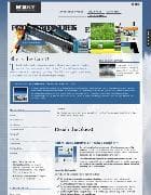
The first universal template JA Elastica.
The network spread to mobile devices, tablets and netbooks. Will your website display correctly for them? A versatile Joomla! – response to General requirements. One pattern suitable for all devices. JA Elastica is changed depending on the device screen, whether its a wide screen monitor or iPad or iPhone.
The template is built on a powerful system JAT3 2 Framework and jQuery Masonry script. JA Elastica works well on all devices and in all mobile browsers.
JA Elastica is released under the GNU/GPL it can be freely downloaded and distributed.
The template doesnt support RTL CSS.
Template features:
In the template system T3 Framework version 2 Tablet and mobile device supports both modes: portrait and landscape. Five options for the layout (extra-wide, wide, normal, tablet, mobile) Universal fonts, sizes, images, logos, etc. Easily configurable (setting the width of the block and each module) Various styles for modules Cross-browser Supported by all mobile browsers 4 menu options: JA Split, JA CSS, JA Dropline and JA Mega menu Inbuilt Google Fonts configuration, CSS and Javascript compression Meets the standard of accessibility 508 CSS file with detailed comments for a more flexible setup.
JA Elastica v2.5.7 - rubber-template for Joomla - Reviews and comments:
There are no reviews for this product. Be the first, write a review.
write a review
The most popular in this category
Why us?

The largest base
We have collected the largest database of pure premium templates and extensions for popular CMS such as Joomla, WordPress, Opencart, etc!

Without hidden links
We guarantee the absence of hidden links and backdoors. Only original files directly from the developers!

Without reference
No bindings to domains! All templates and extensions can be installed on any number of domains and sites.

Low price
Only we have premium templates and extensions from only 5 USD! Cheaper only in free access with viruses, hidden links and backdoors!


